I hadn’t thought much about Venn Diagrams in the past. I had used them and enjoyed the wonderful “Venn that tune”, but I hadn’t really thought
about them.
A link on the front page of the Telegraph website brought me
up short:

33? Seemed rather
unlikely.
Here’s a screenshot of the article. What a beautiful Venn Diagram!
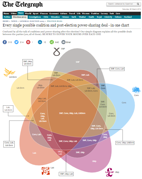
The diagram helps explain what the journalists have done. They have used this as a nice way to show
each of the possible combinations of 5 parties, from the ridiculous (SNP
forming a government by itself – which clearly can’t happen because they only
have candidates in Scotland), to the ridiculous (a 5-way coalition between
Con-Lab-Lib-UKIP-SNP).
It feels as if this ought to be a Pascal’s Triangle
scenario, with 1 way for no parties to be involved, 5 ways for one party to
lead, 10 ways for two parties to govern, etc.
The diagram lends itself to being coloured to show this,
with the 1-party parts shown in red, the 2-party sections in yellow, etc. Including the outside of all of the sets (no
parties govern) that gives us 1, 5, 10, 10, 5, 1. This totals 32, so there are actually 31 different
options for governing rather than the 33 advertised. [This also ignores the possible contribution
of other small parties.]

It is then rather neat to colour other Venn diagrams to
display the relevant row of Pascal’s Triangle:
2 sets: 1, 2, 1 (with
the initial ‘1’ being the white ‘outside’ section).

3 sets: 1, 3, 3, 1

4 sets: 1, 4, 6, 4, 1

So this is yet another place in which Pascal's Triangle crops up. Beautiful!